Social Media for Music Digital Magazine
Social Media for Music Digital Magazine
We Don't Care. (WDC) is a digital magazine for new musical talent. With interviews of musicians and new song releases featured all the time, the brand needed to engage with its audience quickly.


Branding Priorities
Branding Priorities
Pre-Production
In this project, I was hired to refresh the company’s branding as well as their social media marketing. In order to achieve this task, I needed to know how they planned to reach their target audience. In other words, I needed to understand the company's branding priorities.
Since this brand showcases new musical talent, in which the musical talent has their own marketing aesthetic, I needed to develop a brand that wouldn’t visually clash with lots of other aesthetics. This can be a tough can of worms, relatively speaking, because the
In this project, I was hired to refresh the company’s branding as well as their social media marketing. In order to achieve this task, I needed to know how they planned to reach their target audience. In other words, I needed to understand the company's branding priorities.
Since this brand showcases new musical talent, in which the musical talent has their own marketing aesthetic, I needed to develop a brand that wouldn’t visually clash with lots of other aesthetics. This can be a tough can of worms, relatively speaking, because the success of a brand lies in how recognizable it is. Also, since this is a music-related brand, which means it functions in an oversaturated market, the brand needs to have a certain visual swagger. In order to achieve the swagger without clashing against each artist’s visual content, I created black and white brand materials that acted as a frame for each artist's branded material. I also applied texture that made each asset seem retro —I gave the brand a 1960’s space race feel.
success of a brand lies in how recognizable it is. Also, since this is a music-related brand, which means it functions in an oversaturated market, the brand needs to have a certain visual swagger. In order to achieve the swagger without clashing against each artist’s visual content, I created mainly black and white graphics that frames each artist's branding material. I also applied texture to make each asset seem retro —as in 1960’s space race retro.
Moodboard
Moodboard
Pre-Production
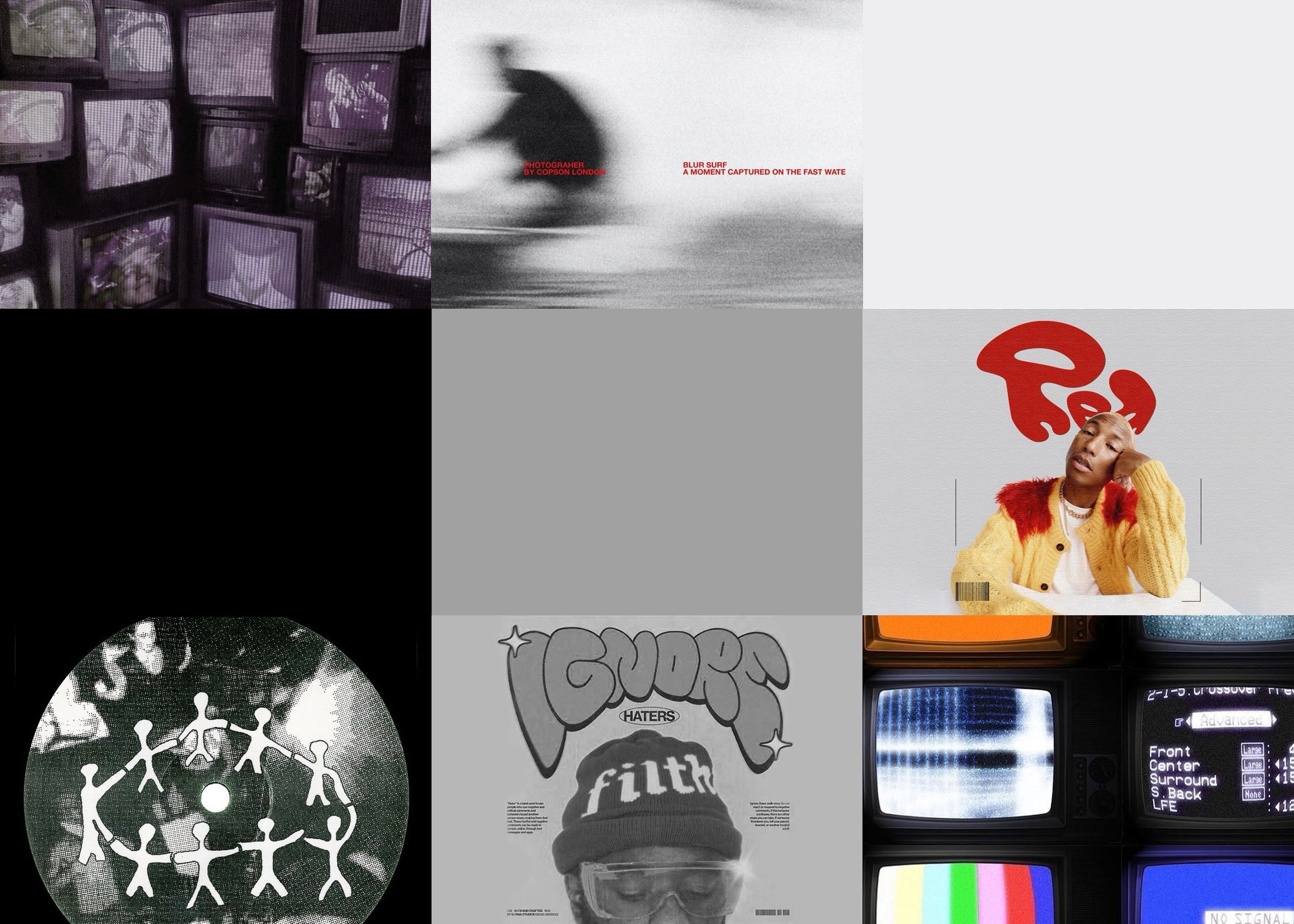
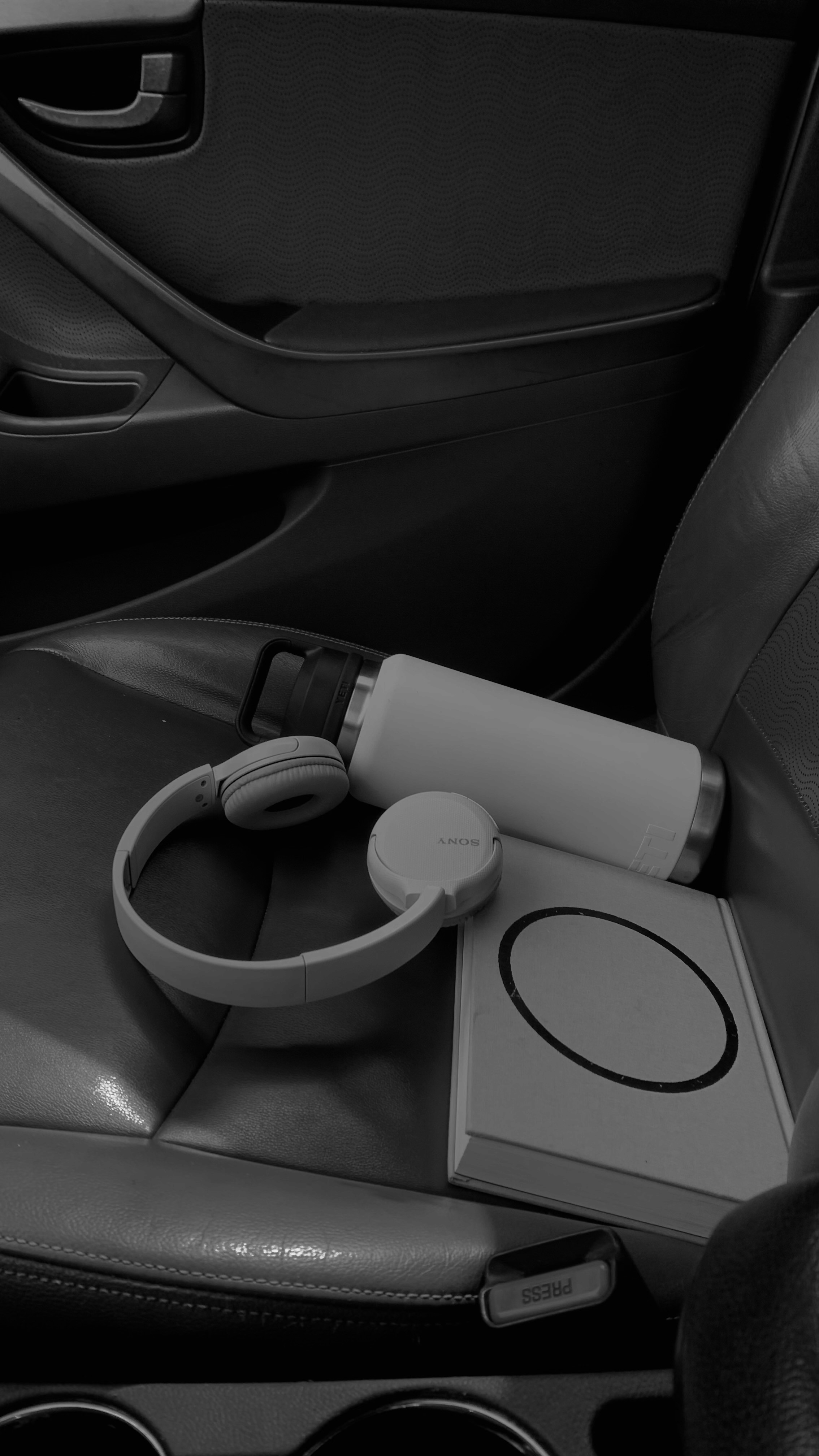
In this moodboard, I focused on researching music-related graphic design. I found that black and white aesthetic helps other colors pop while maintaining a sophisticated look.
In this moodboard, I focused on researching music-related graphic design. I found that black and white aesthetic helps other colors pop while maintaining a sophisticated look.

Style Guide
Style Guide
Pre-Production
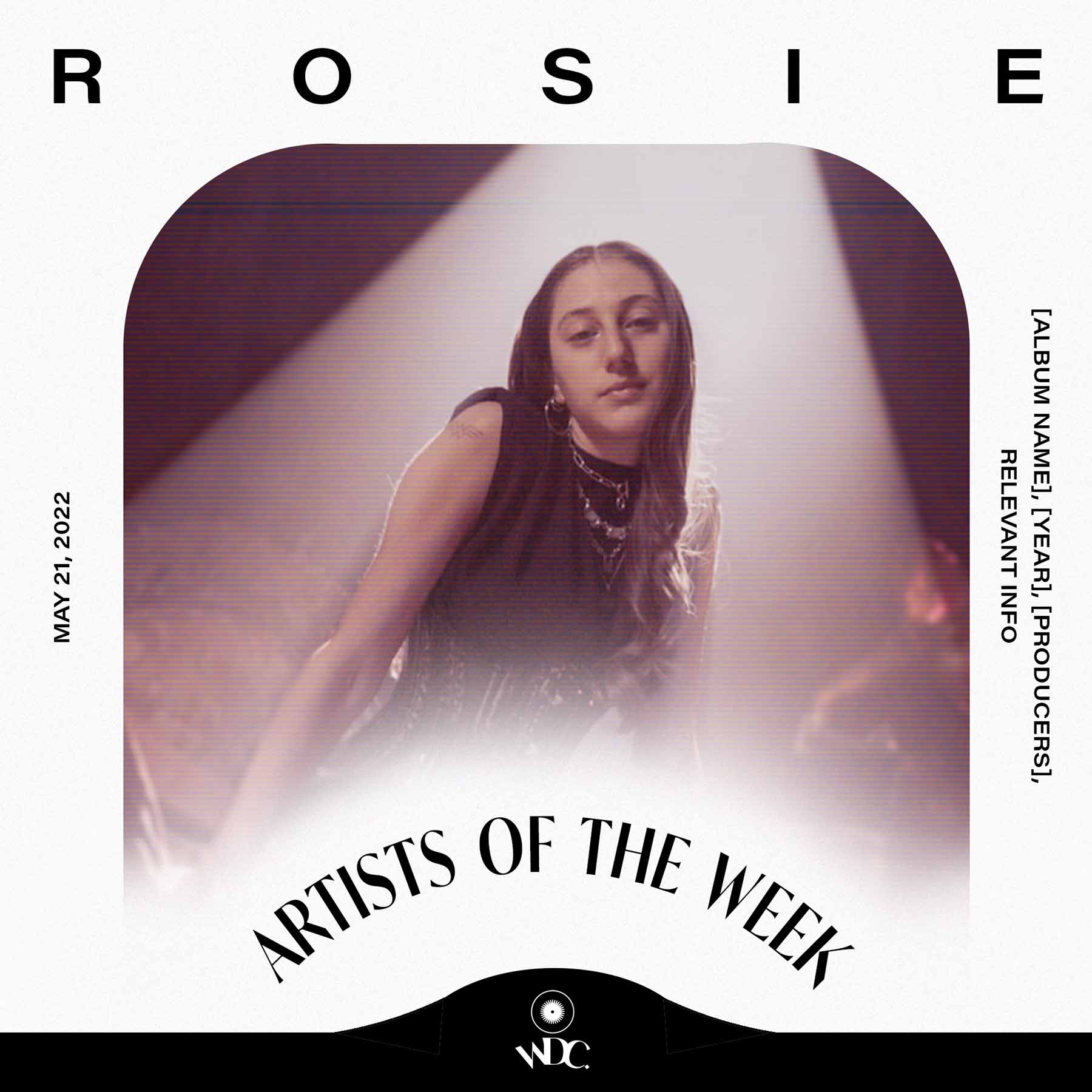
As mentioned in the moodboard section, I wanted a greyscale color palette. In addition, I created a retro object as a frame for editable smart objects in each marketing asset. This was a simple way to create visual interest post by post while maintaining a consistent stylized aesthetic for the brand.

As mentioned in the moodboard section, I wanted a greyscale color palette. In addition, I created a retro object as a frame for editable smart objects in each marketing asset. This was a simple way to create visual interest post by post while maintaining a consistent stylized aesthetic for the brand.
Rough Drafts
Pre-Production
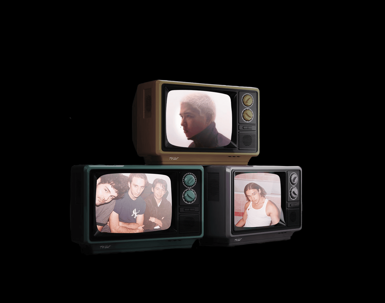
As can be seen in the images, I wanted to highlight each artists’ marketing. However, the first rough drafts had too high of contrast. They also featured pillow and chrome effects on title letters. While these effects look cool, they represent visual trends that have inevitably fallen out of trend quickly —they weren’t as timeless as was desired.

As can be seen in the images, I wanted to highlight each artists’ marketing. However, the first rough drafts had too high of contrast. They also featured pillow and chrome effects on title letters. While these effects look cool, they represent visual trends that have inevitably fallen out of trend quickly —they weren’t as timeless as was desired.
Results
Results
Post-Production
For this project, I developed branding guidelines and social media marketing assets that defined the organization’s visual identity. These assets built trust and credibility, helping WDC connect with emerging indie artists and
foster long-term collaborations.
For this project, I developed branding guidelines and social media marketing assets that defined the organization’s visual identity. These assets built trust and credibility, helping WDC connect with emerging indie artists and
foster long-term collaborations.
With a cohesive brand presence, their social media saw a 115% increase in likes, a 160% boost in engagement, and a 190% rise in followers.
With a cohesive brand presence, their social media page saw a 115% increase in likes, a 160% boost in engagement, and a 190% rise in followers.
Final Product
Final Product
Post-Production


Get In Touch
Get In Touch
Graphic Designer
Daisy Bell
Framer 2024
Graphic Designer
Social Media for Music Digital Magazine
Made social media materials that increased followers & online engagement.
Branding
Priorities
Pre-Production
In this project, I was hired to refresh the company’s branding as well as their social media marketing. In order to achieve this task, I needed to know how they planned to reach their target audience. In other words, I needed to understand the company's branding priorities.
Since this brand showcases new musical talent, in which the musical talent has their own marketing aesthetic, I needed to develop a brand that wouldn’t visually clash with lots of other aesthetics. This can be a tough can of worms, relatively speaking, because the success of a brand lies in how recognizable it is. Also, since this is a music-related brand, which means it functions in an oversaturated market, the brand needs to have a certain visual swagger. In order to achieve the swagger without clashing against each artist’s visual content, I created black and white brand materials that acted as a frame for each artist's branded material. I also applied texture that made each asset seem retro —I gave the brand a 1960’s space race feel.
Moodboard
Pre-Production

In this moodboard, I focused on researching music-related graphic design. I found that black and white aesthetic helps other colors pop while maintaining a sophisticated look.
Style Guide
Pre-Production
As mentioned in the moodboard section, I wanted a greyscale color palette. In addition, I created a retro object as a frame for editable smart objects in each marketing asset. This was a simple way to create visual interest post by post while maintaining a consistent stylized aesthetic for the brand.
Results
Post-
Production
For this project, I developed branding guidelines and social media marketing assets that defined the organization’s visual identity. These assets built trust and credibility, helping WDC connect with emerging indie artists and foster long-term collaborations.
With a cohesive brand presence, their social media saw a 115% increase in likes, a 160% boost in engagement, and a 190% rise in followers.
Final Product
Post-Production
Rough Drafts
Pre-Production
As can be seen in the images, I wanted to highlight each artists’ marketing. However, the first rough drafts had too high of contrast. They also featured pillow and chrome effects on title letters. While these effects look cool, they represent visual trends that have inevitably fallen out of trend quickly —they weren’t as timeless as was desired.